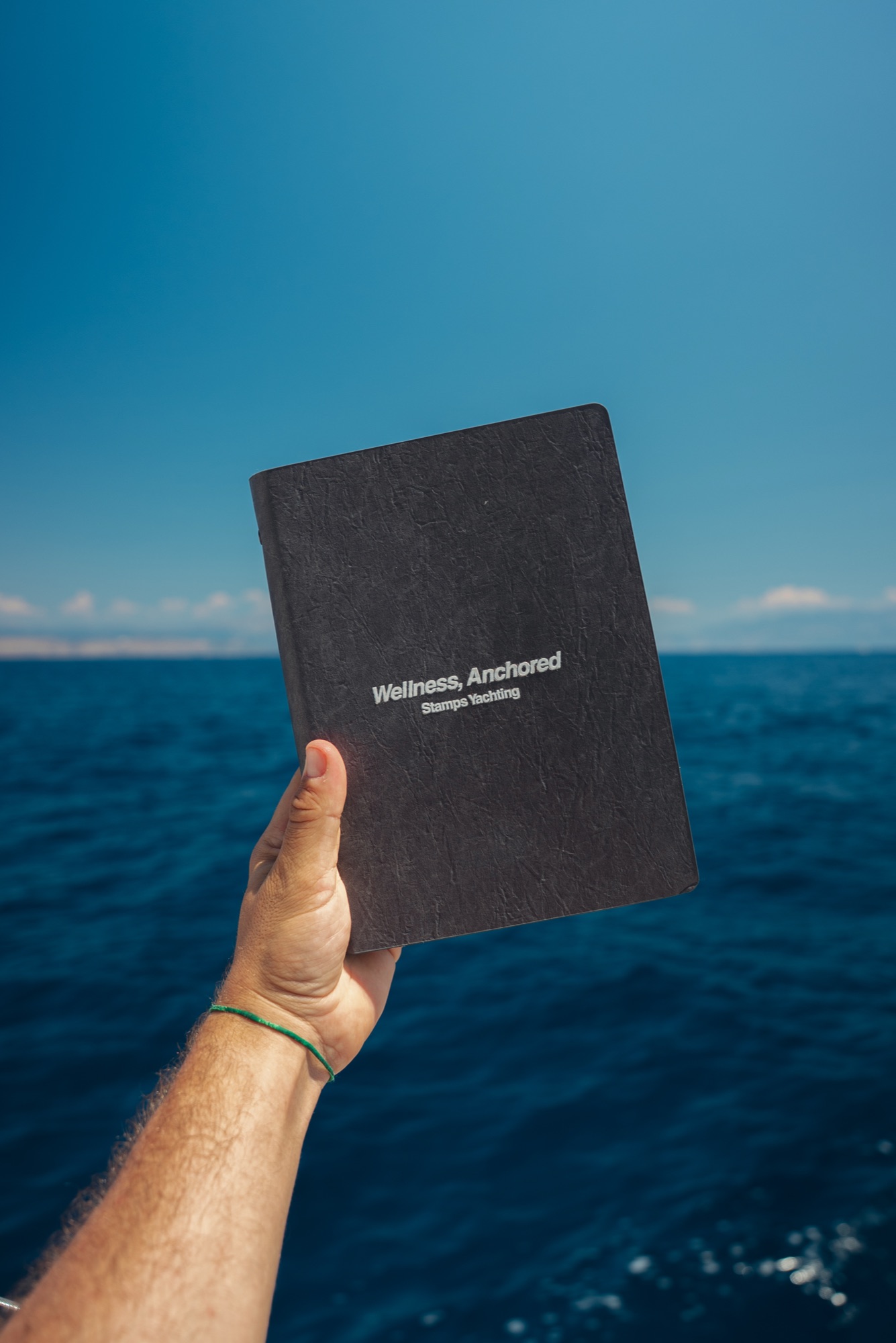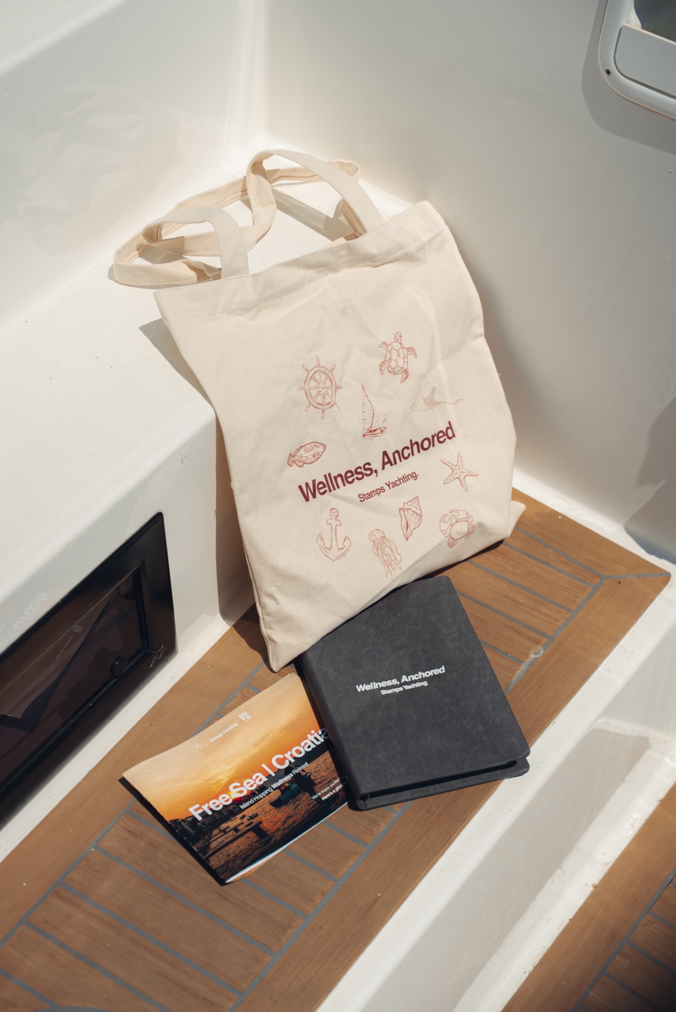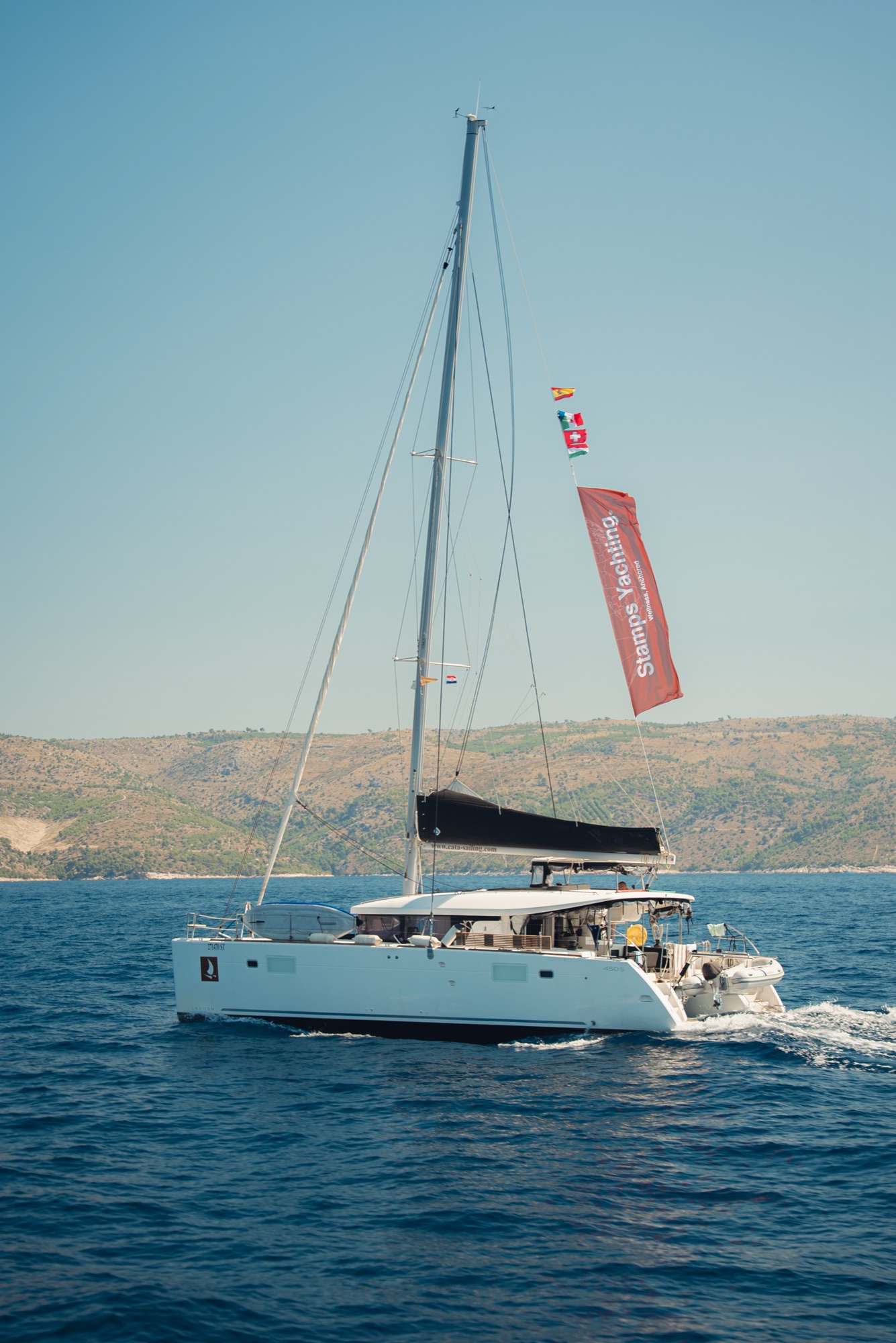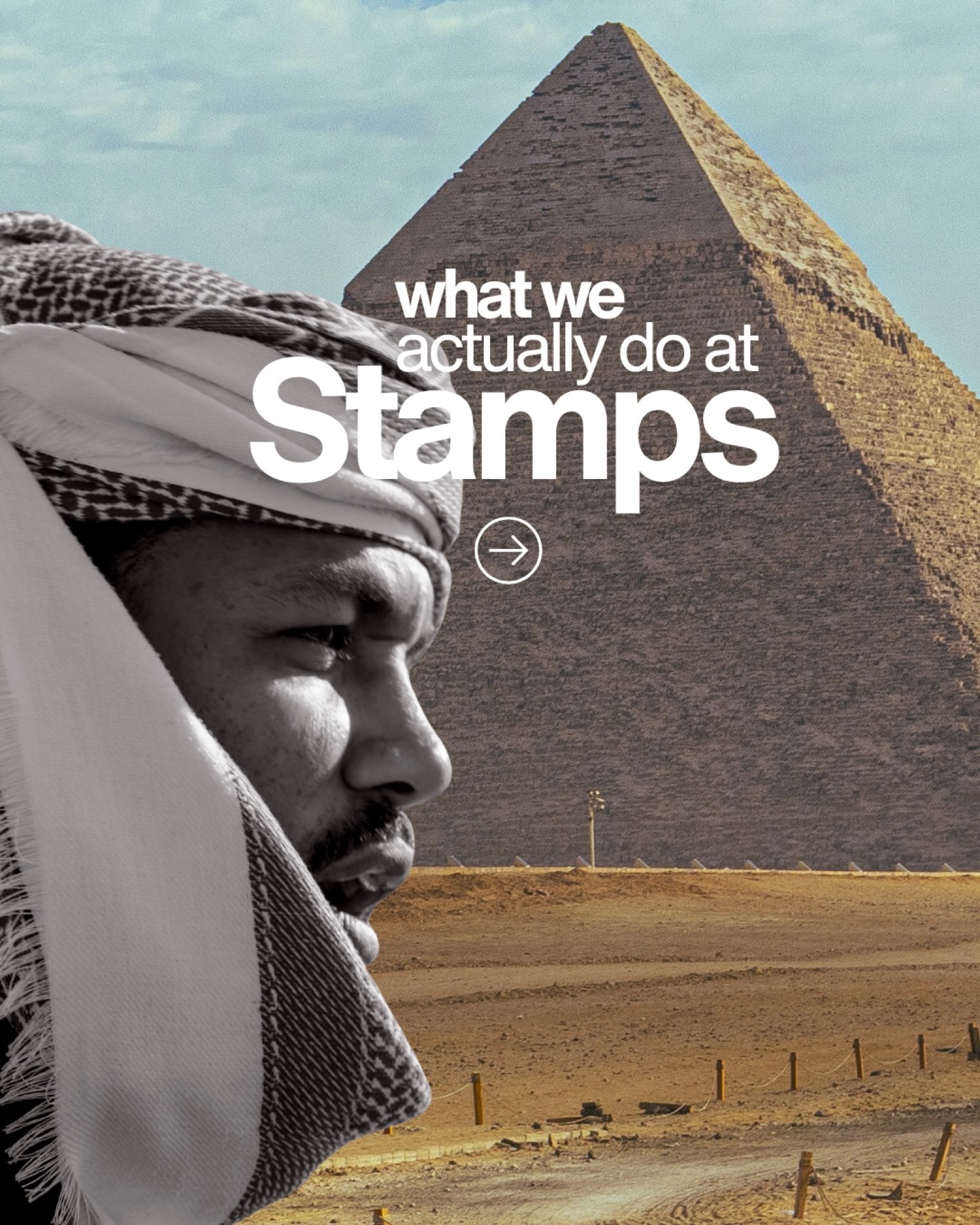
A rebrand for Stamps Tours — a travel company running movement-led journeys across Egypt, Morocco and the UAE, and wellness sailing weeks on the Adriatic under Stamps Yachting. The brief was to keep what the brand was known for while moving it somewhere quieter and more editorial.
The palette does most of that work: the deep burgundy stays as the signature accent, carrying warmth, heritage and a sense of adventure, but it now sits on a dominant foundation of coal, off-white and snow so the candid photography can take the centre. The type system runs a heavy header face against Helvetica Neue for subheads and a handwritten face reserved for captions, with all weights available depending on context. Around it sits a drawn set of elements, a mascot mark — "The Explorer" — restricted to the middle or the corners of an image, and a destination language built on the outlines of the three countries.
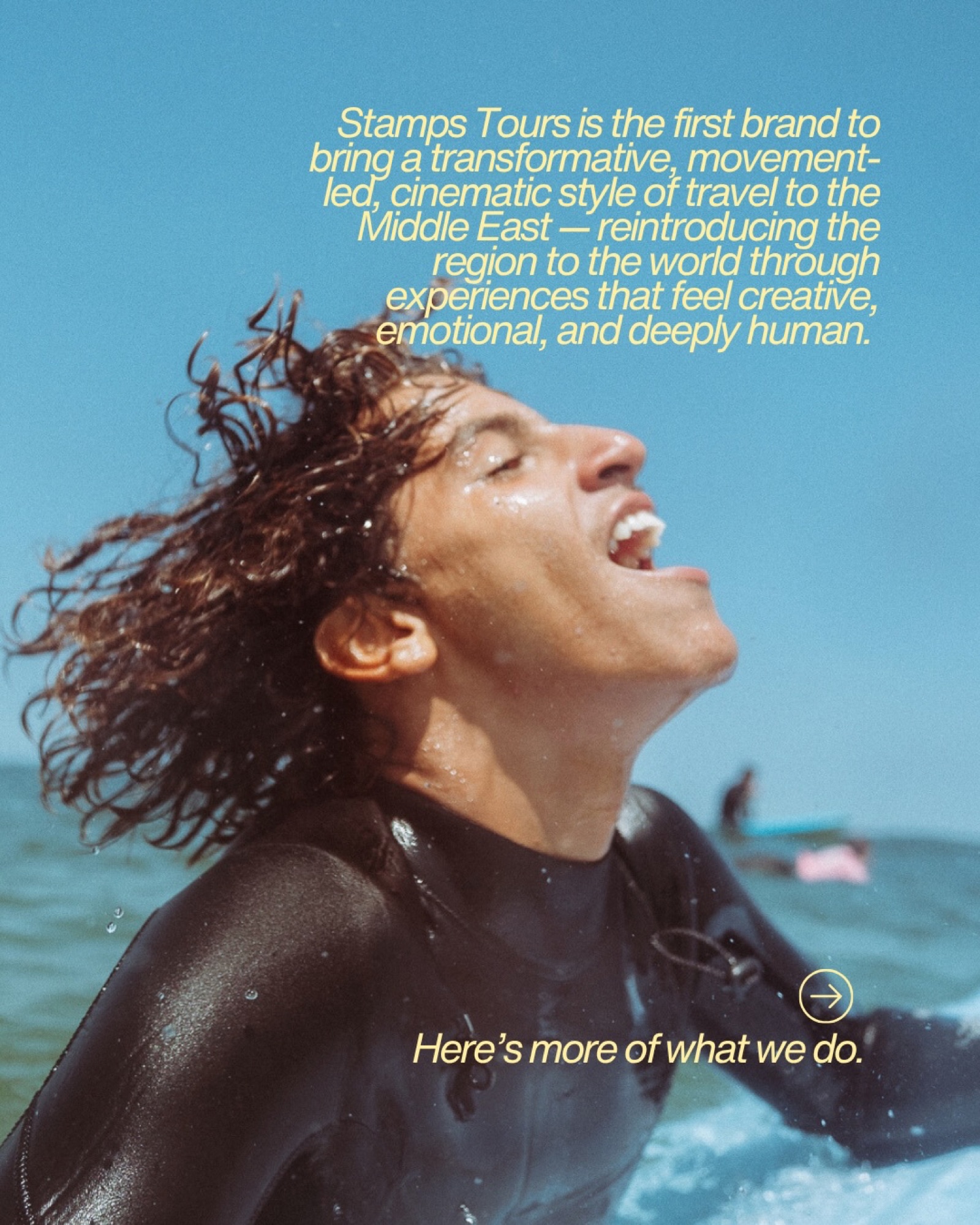
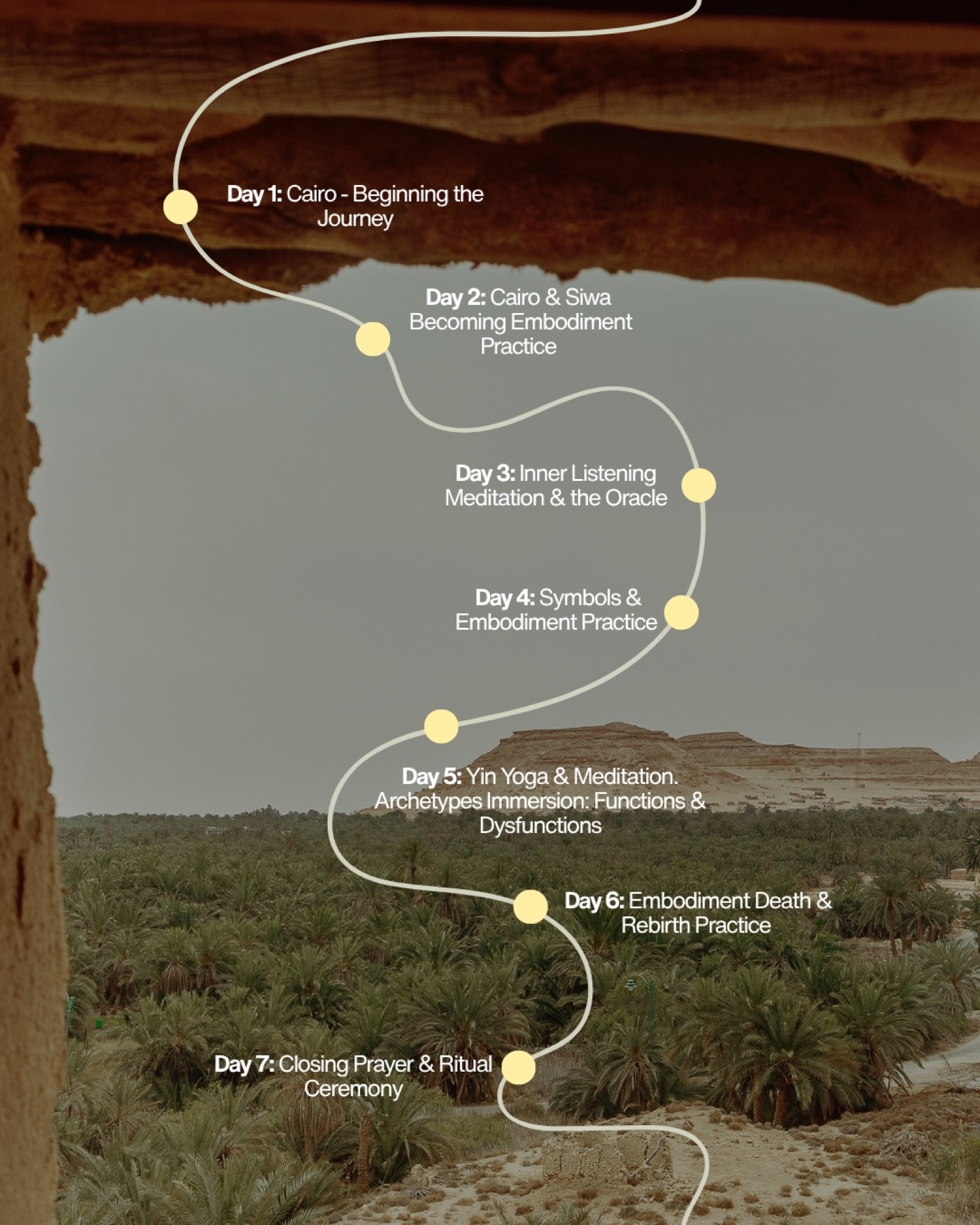
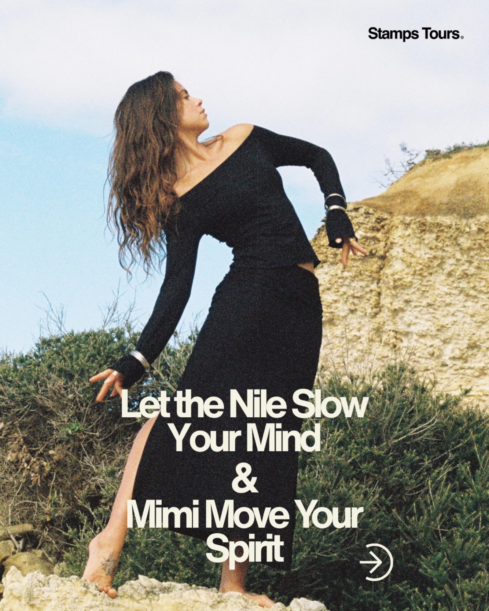
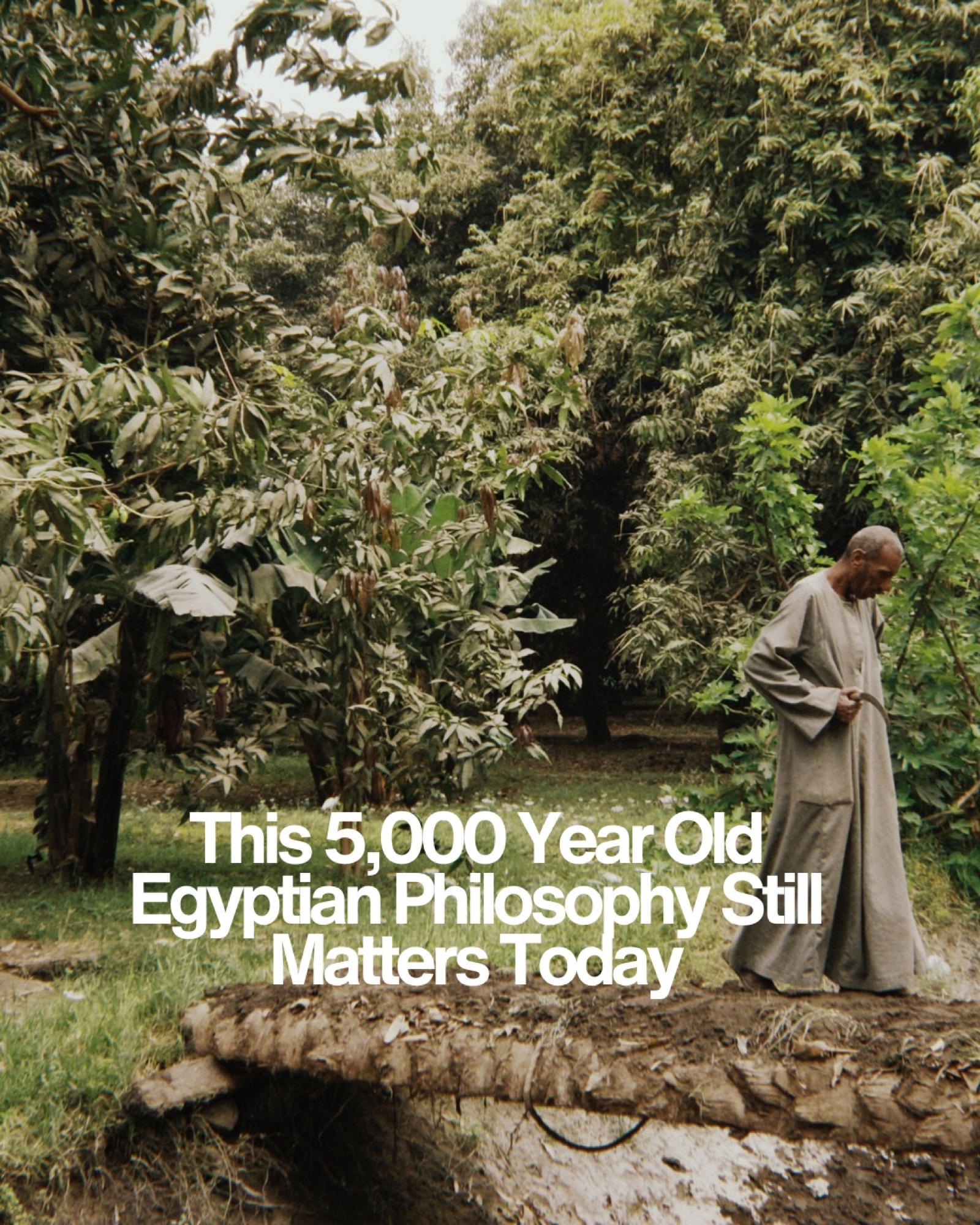
The rollout carries it into the feed: itinerary maps, founder-led pieces to camera, and travel films cut for a brand positioning itself as the first to bring a transformative, cinematic style of travel to the region.