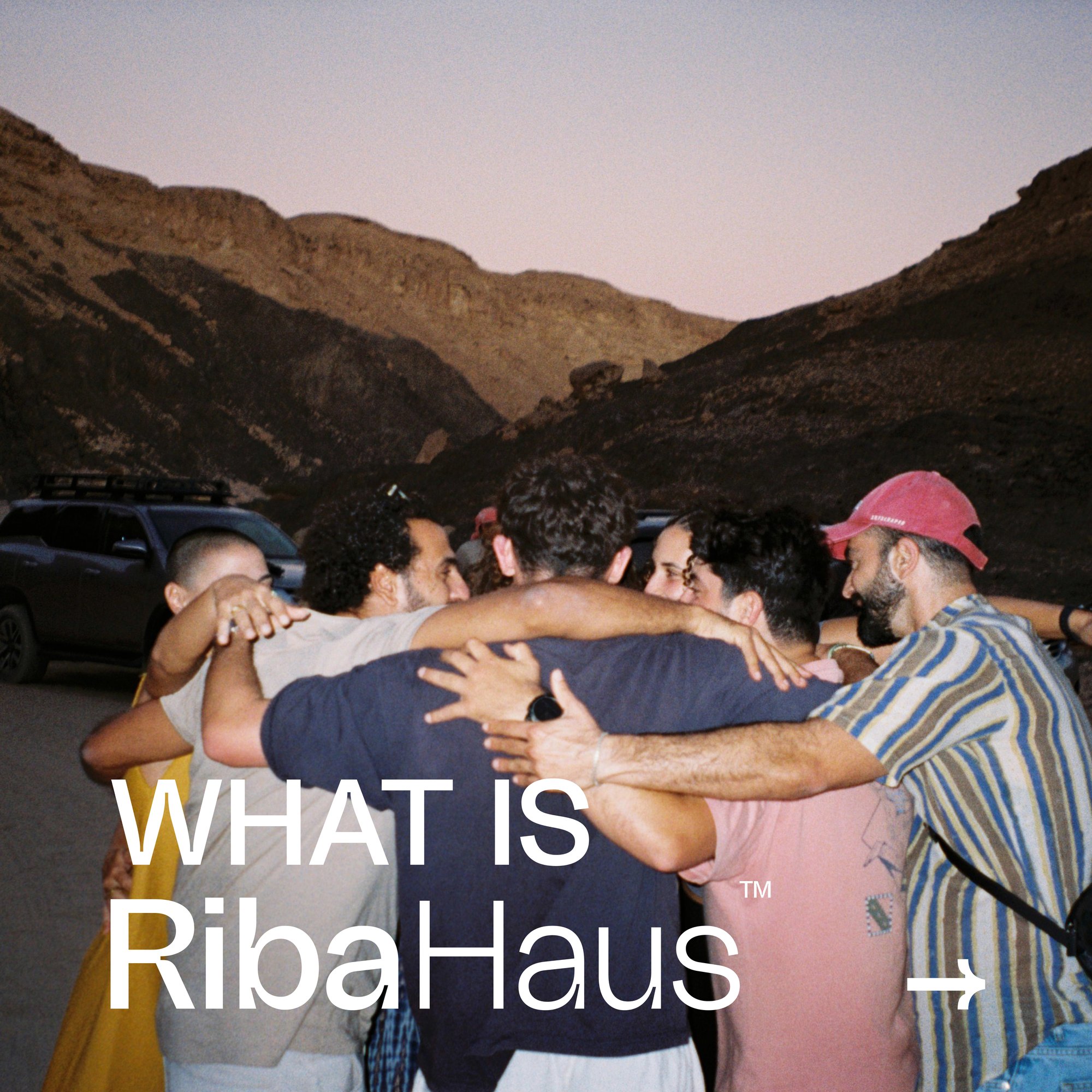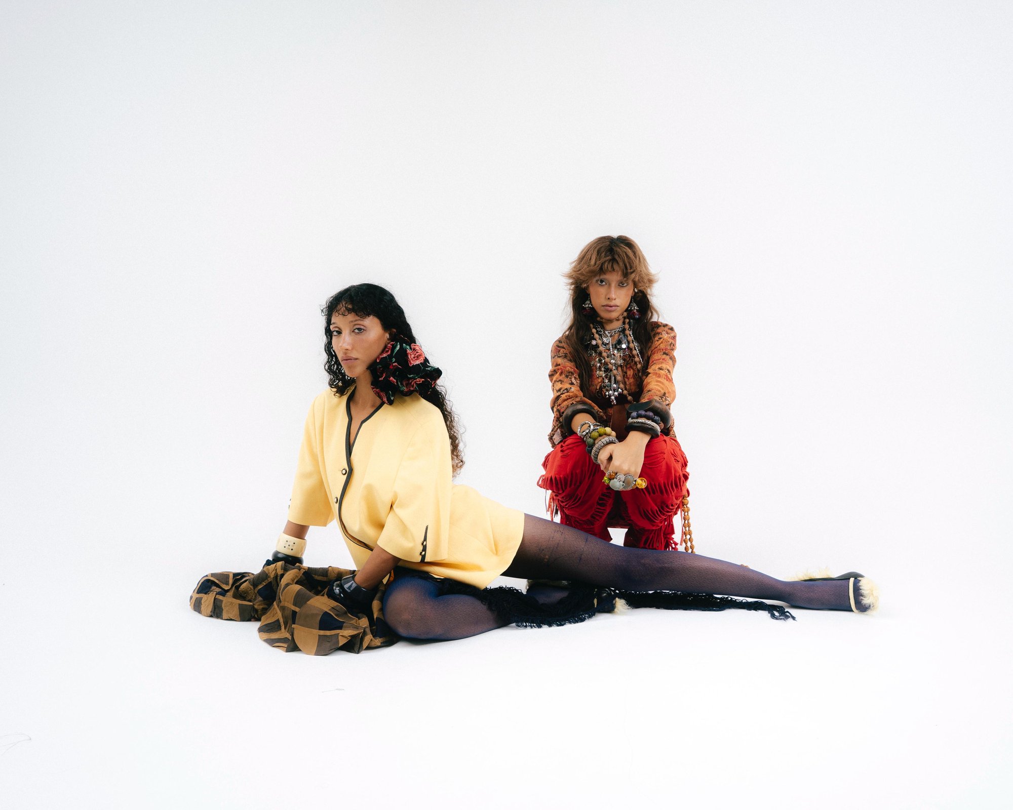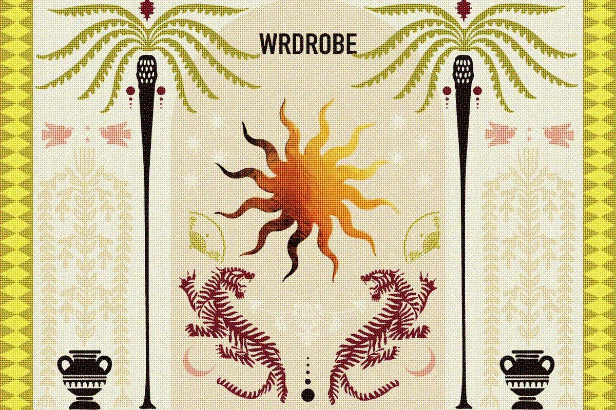
A full brand identity and guidelines system for RibaHaus, a creative studio built to bridge strategic thinking and fearless creativity — “in a world full of noise, we create clarity.” The name (ree.ba) means fish, adopted as a symbol of growth, fluidity and adaptability in a shifting digital landscape and carried into both a wordmark and a mascot mark. Foundations run from mission, vision and story to a personality that is bold, energetic, quirky, collaborative and grounded, and a positioning as the bridge between business-minded strategy and wildly creative execution. The visual system pairs three typefaces (NT-Voice, Dark Paradise, Neue Regrade) with a vivid, versatile palette — tangerine, lime, teal, banana, pink, electric blue, burgundy — and an imagery style described as conversational, intimate and contrasting, documenting real cultural moments.