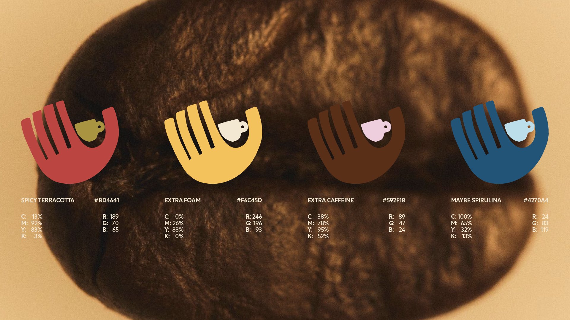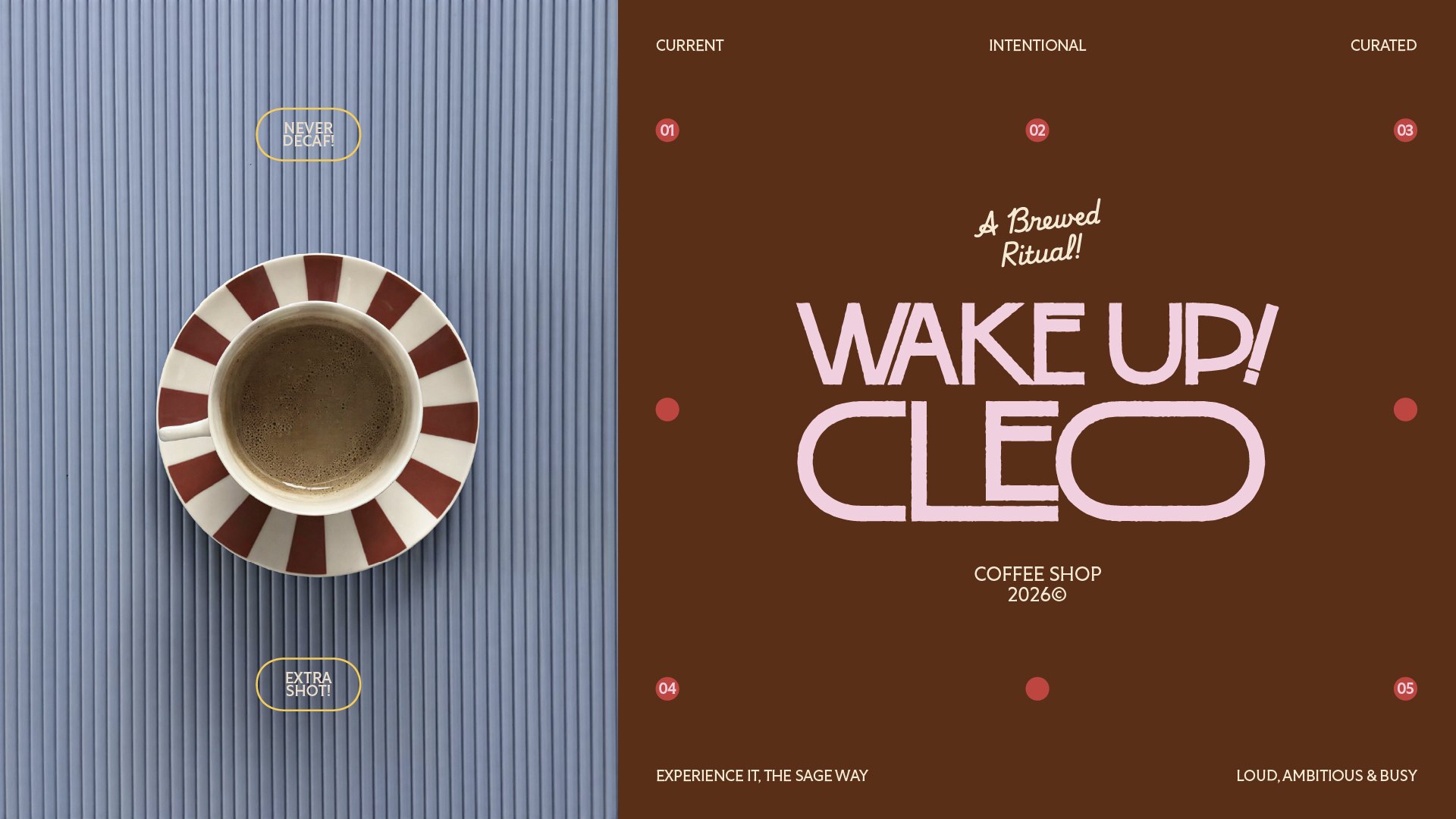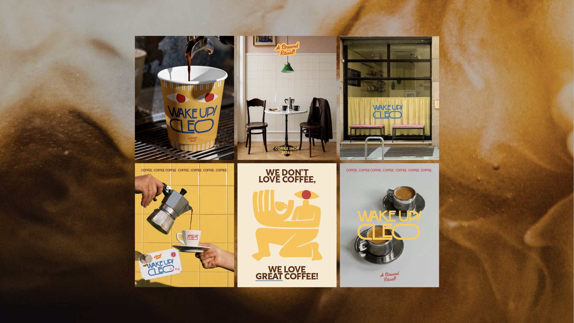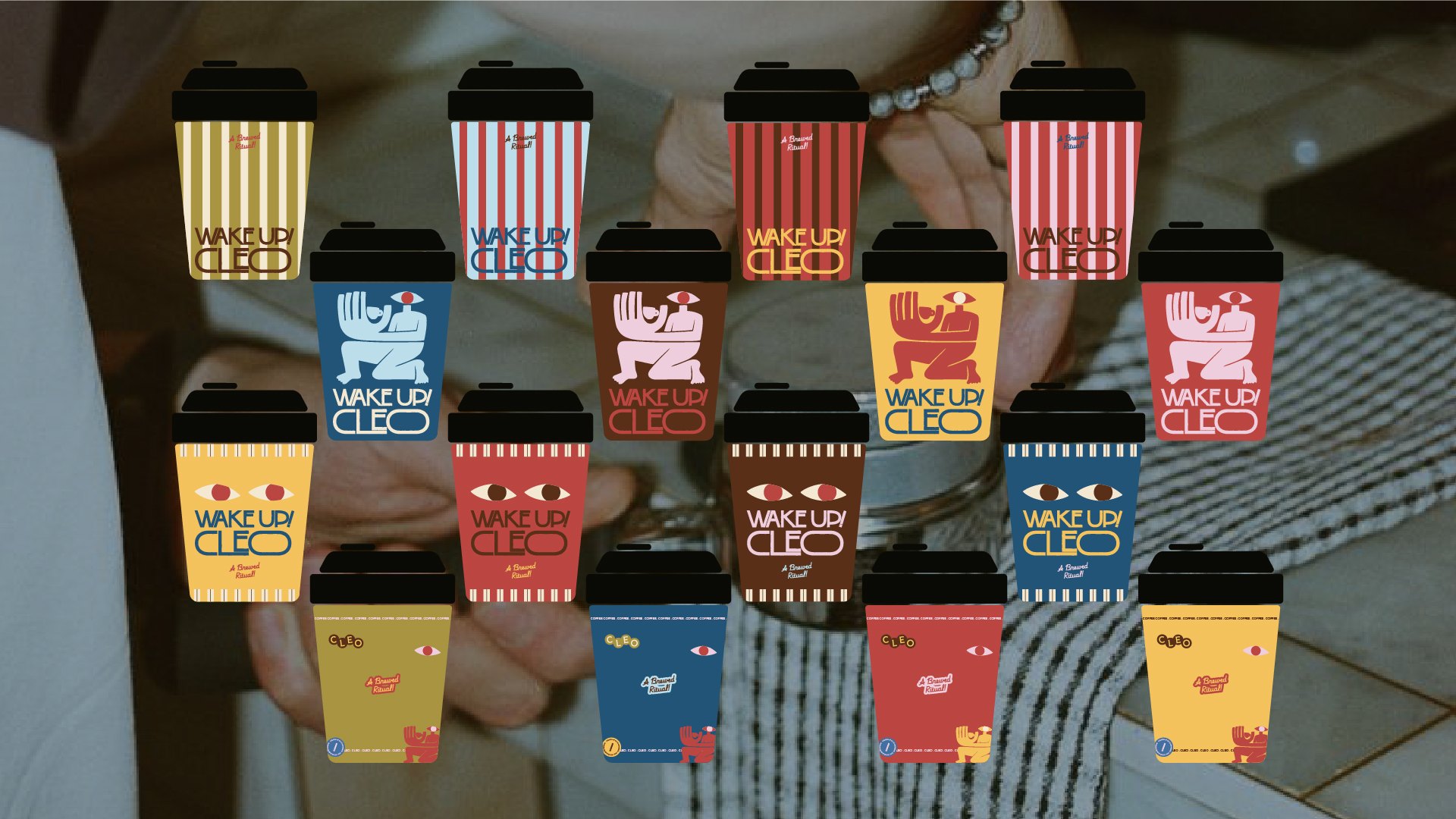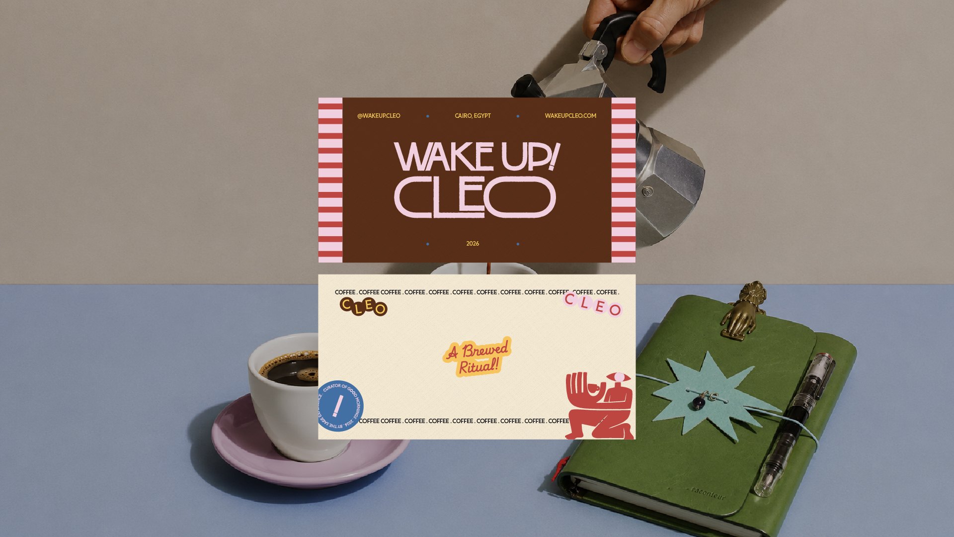
Wake Up! Cleo is the brand identity we built for a new specialty coffee concept by the Sage Experience — they came to us with a sharp strategic brief and a clear point of view on who the brand was for. Our job was to translate that strategy into a visual and verbal identity: a name, a voice, a color story, and a full system of applications, from cup to apron to coffee bag.
The result is a loud, warm, unapologetically Egyptian coffee brand built around a fictional persona — Cleo — who is busy, curious, and always slightly over-committed, in the best way.
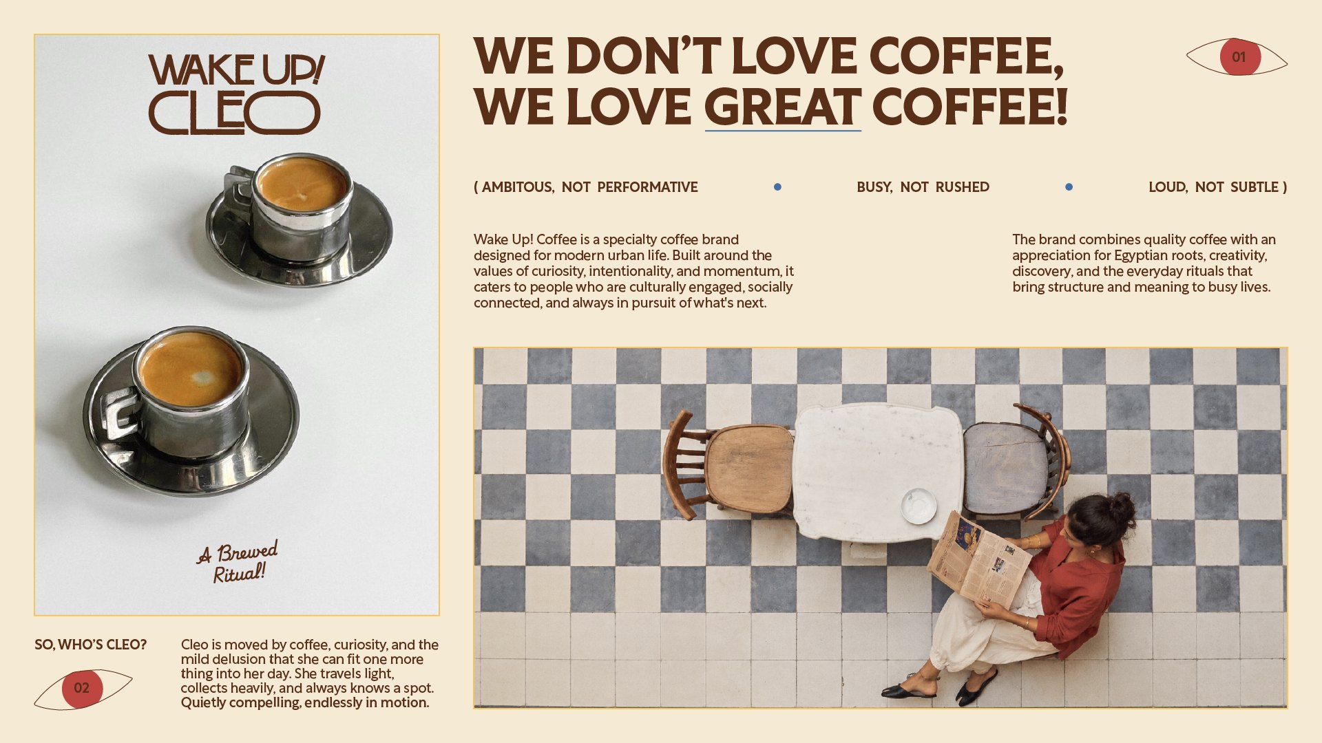
Discovery: Meeting CleoBefore any logo work started, Sage handed us a fully formed persona to design for, not just design at. Cleo — short for Cleopatra — is “moved by coffee, curiosity, and the mild delusion that she can fit one more thing into her day. She travels light, collects heavily, and always knows a spot. Quietly compelling, endlessly in motion.” She has impeccable taste and knows it. She collects rather than consumes — drawn to bold geometry, striped textiles, handmade ceramics, and objects with history over anything trendy. She's witty, observant, a little intimidating, and she orders for the table. For her, coffee isn't fuel — it's ritual. A reason to slow down and let the conversation outlast the cup. This persona became our north star. Every typographic choice, every color, every piece of copy got run through one filter: would Cleo approve, or would she find it try-hard?
Name & Meaning“Wake Up! Cleo” does double duty — it's a literal call to action (this is a coffee shop, after all) and a nod to Cleo's own relationship with her city: she doesn't shy away from her roots, and neither does the brand. The exclamation mark isn't decorative — it's the loud, ambitious energy of the brand condensed into one piece of punctuation.
PositioningWake Up! Cleo sits at the intersection of specialty coffee craft and modern Egyptian identity. It's built for people who are culturally engaged, socially connected, and always chasing what's next — but who still want a “brewed ritual,” not a drive-through transaction.
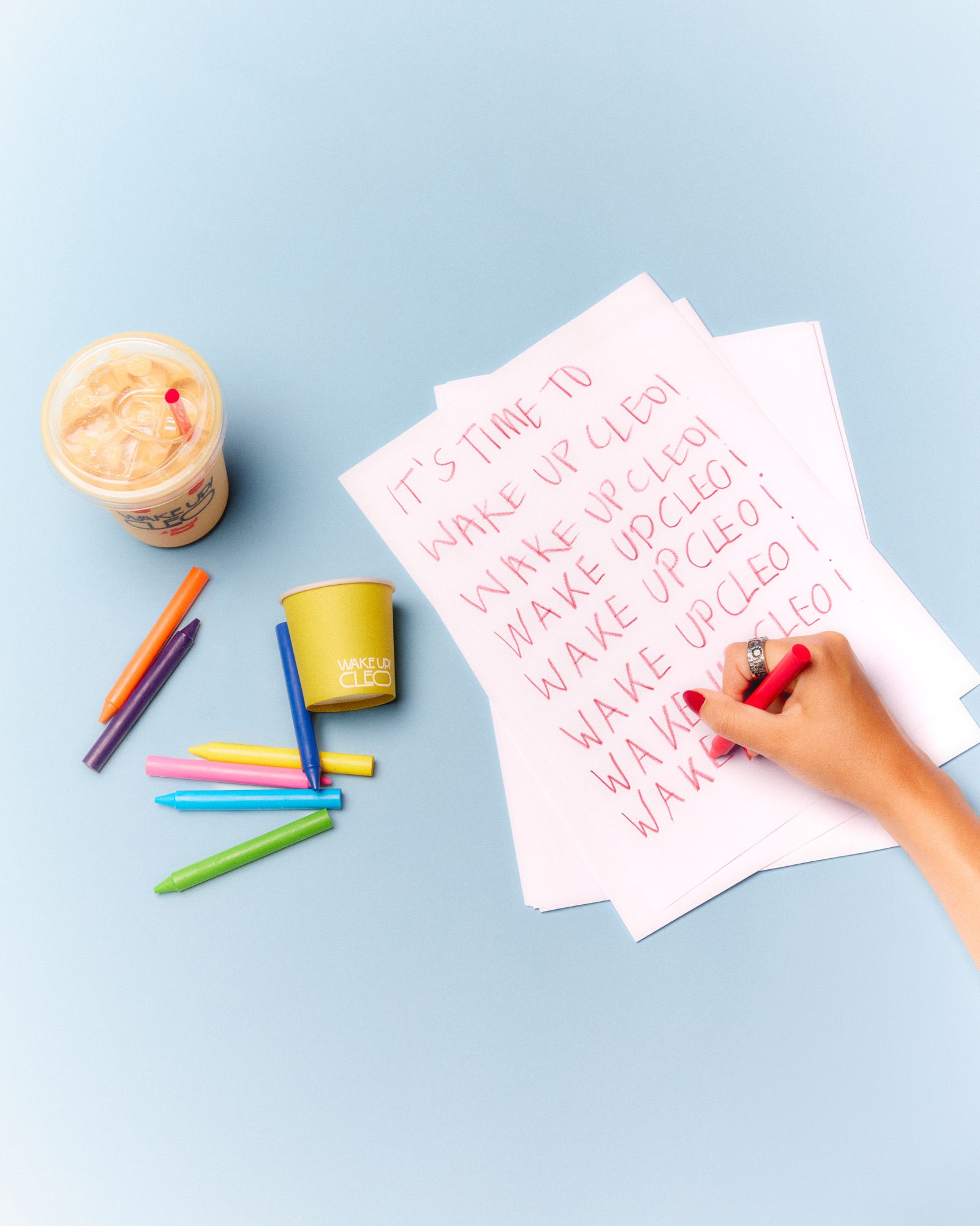
VoiceCleo speaks in the first person, loud and declarative — “I AM A ___,” “HEY,” “WAKE UP NOW!” The tone borrows from bold vintage protest-poster and signage typography rather than soft, minimal café branding. It's confident, a little cheeky, never precious.
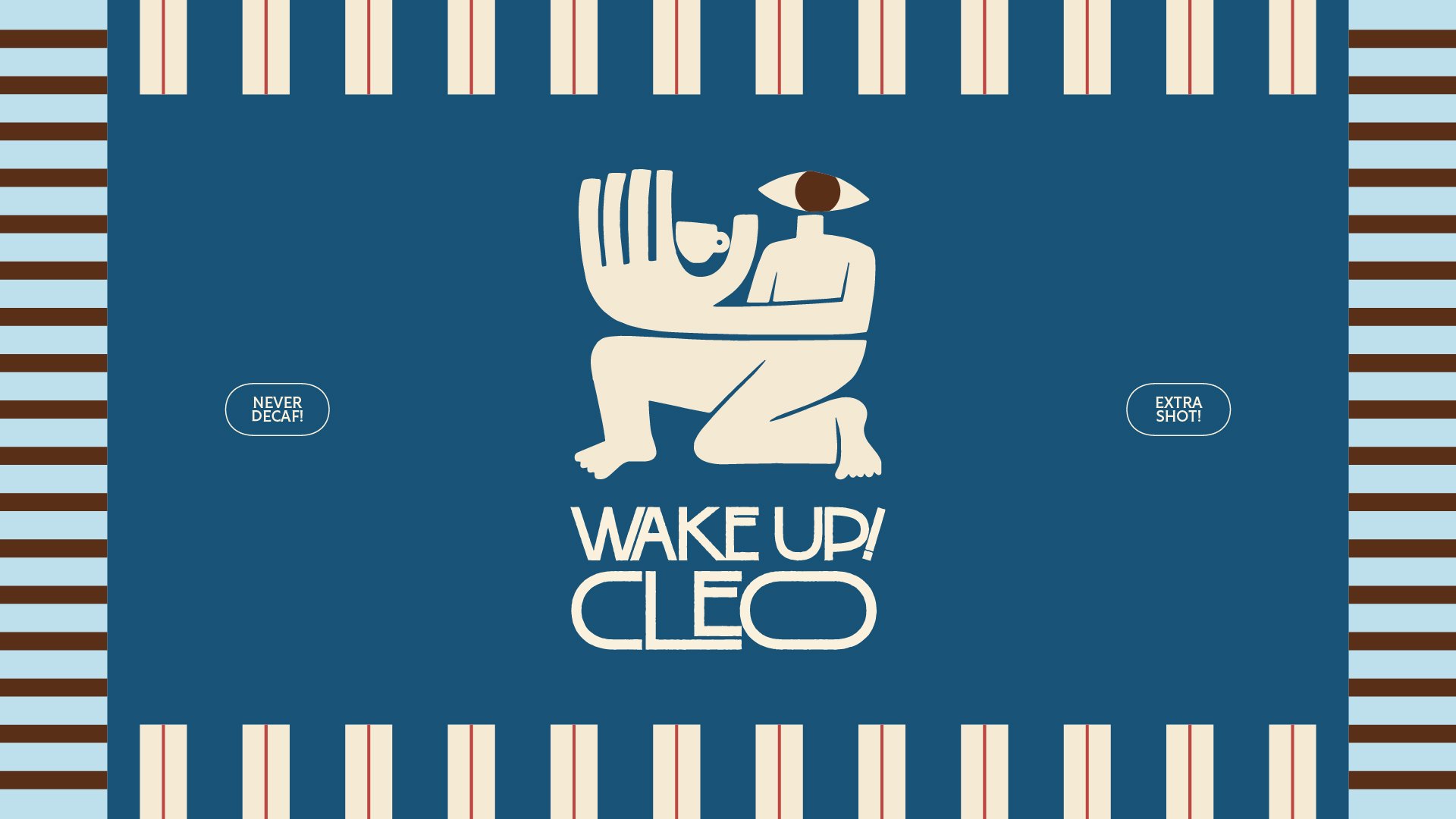
WordmarkThe “WAKE UP! CLEO” logotype uses a tall, condensed serif for impact paired with a rounded, almost hand-drawn sans for “CLEO” — giving the mark two personalities at once: the urgency of the wake-up call, and the warmth of the person being called. A small hand-lettered tagline, “A Brewed Ritual,” sits alongside it as a softer, more intimate counterpoint.
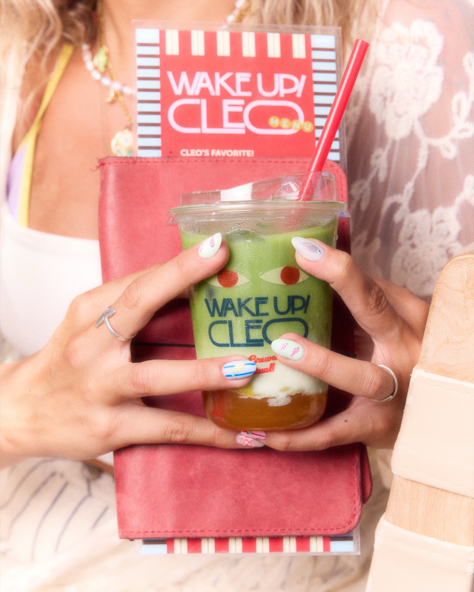
IconographyThe central visual motif is an abstracted eye — a direct nod to ancient Egyptian iconography (the Eye of Horus) reimagined in flat, graphic shapes. It reappears everywhere: on cups, stickers, the coffee bean bag, even hidden inside a pair of illustrated hands. A recurring kneeling figure holding a cup, rendered as a single flat silhouette, acts as the brand's unofficial mascot — equal parts ancient relief carving and modern pictogram.
Typography & LayoutBold, oversized display type dominates every touchpoint, echoing vintage magazine covers, protest signage, and hand-painted shopfronts (the mood board leaned heavily on references like bold Polish poster design, Marcel Duchamp-style word-play, and hand-lettered “OPEN” signs). Striped patterns — a nod to Cairo café awnings and market textiles — recur as a structural device across packaging and print.
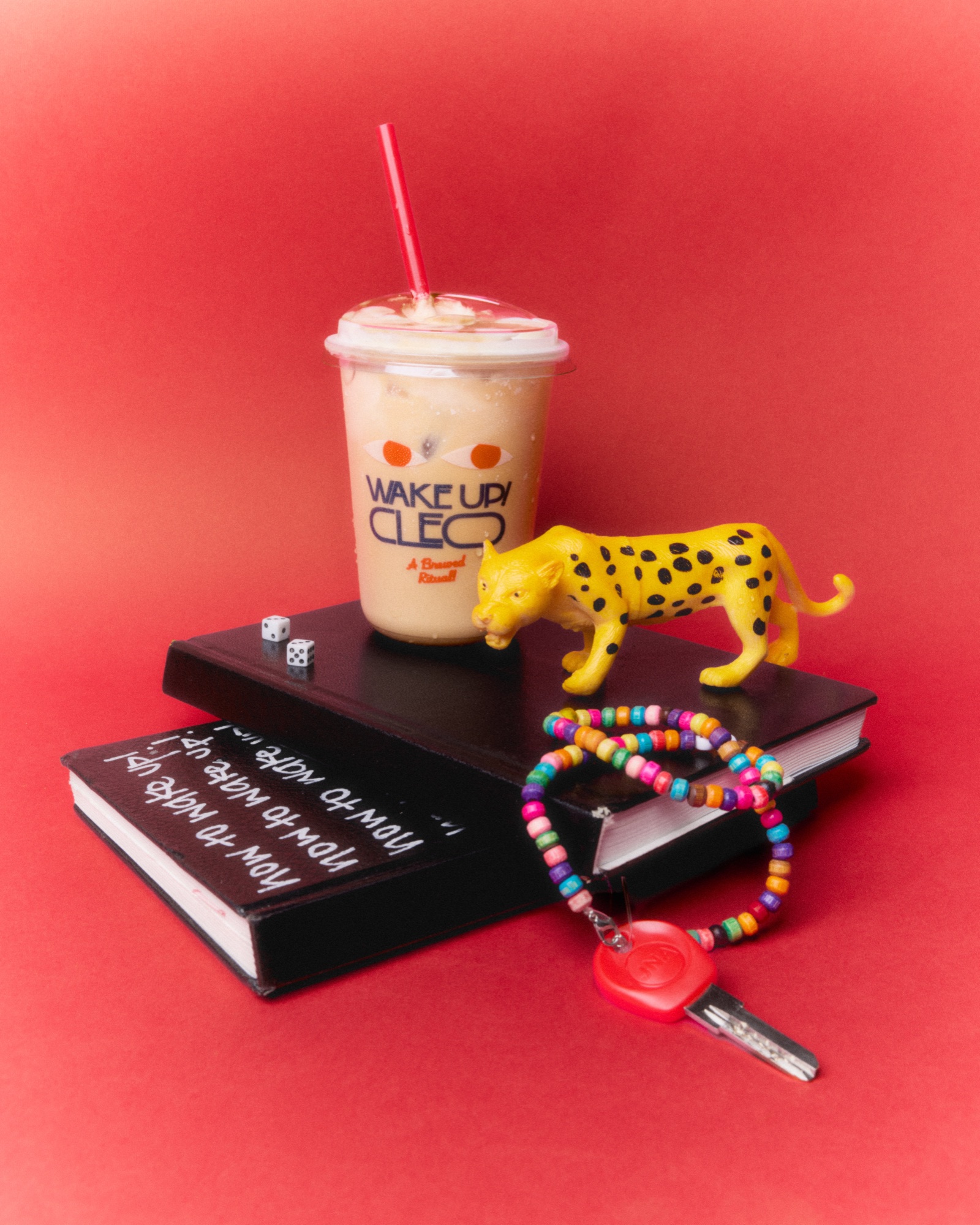
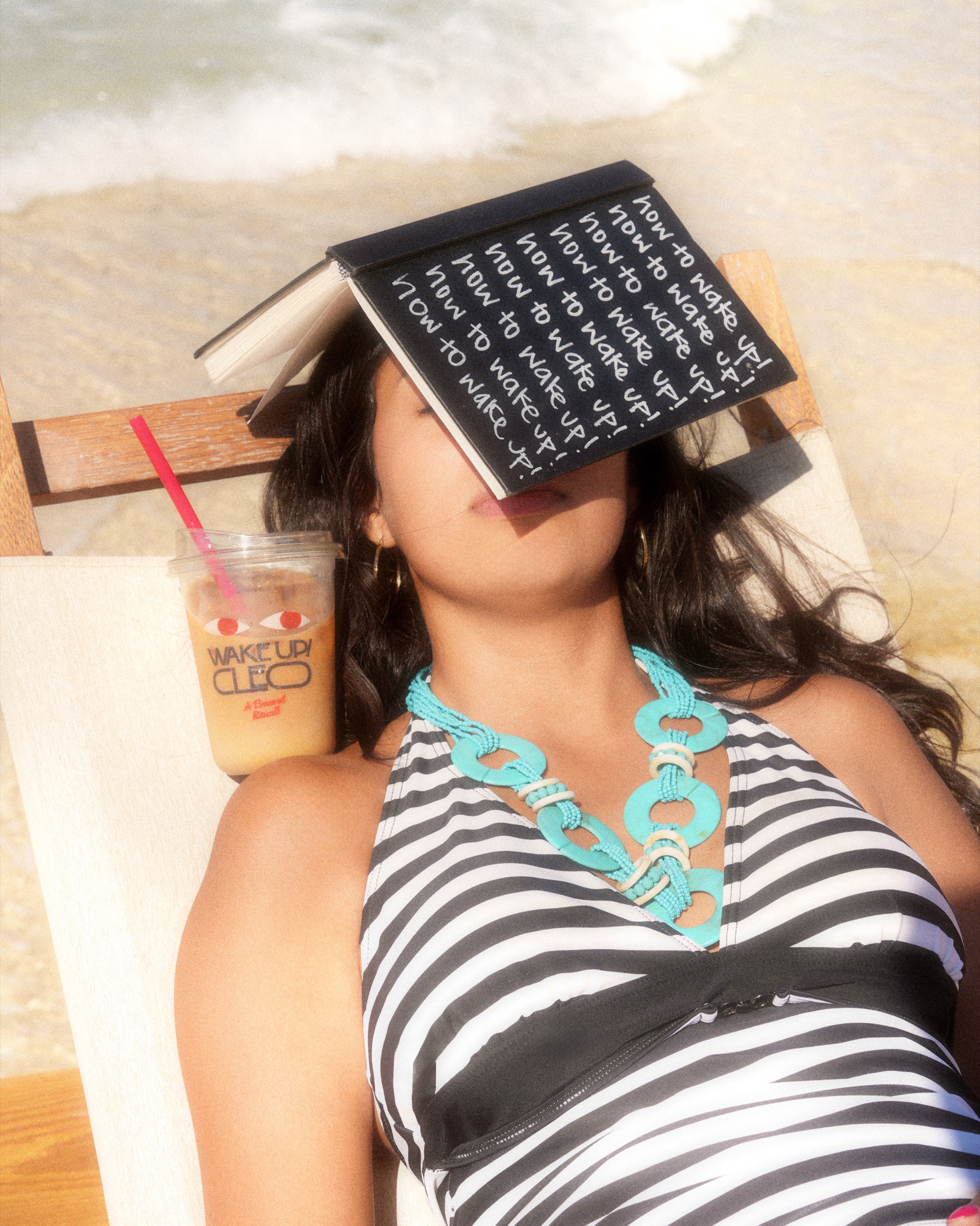
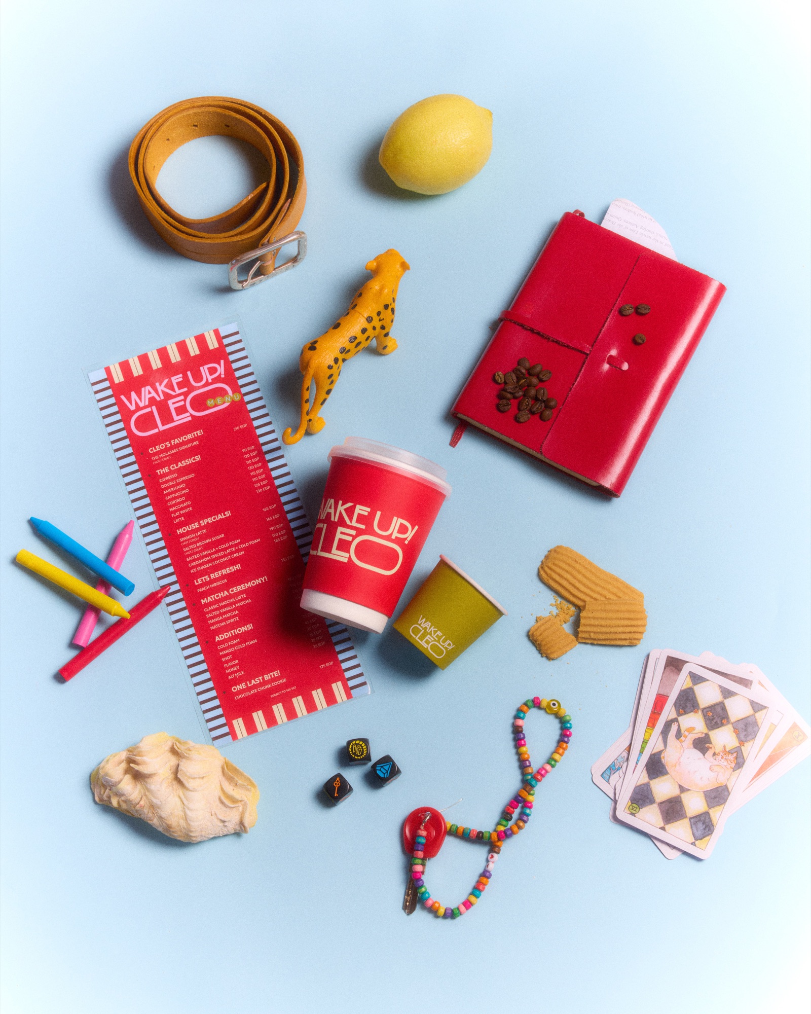
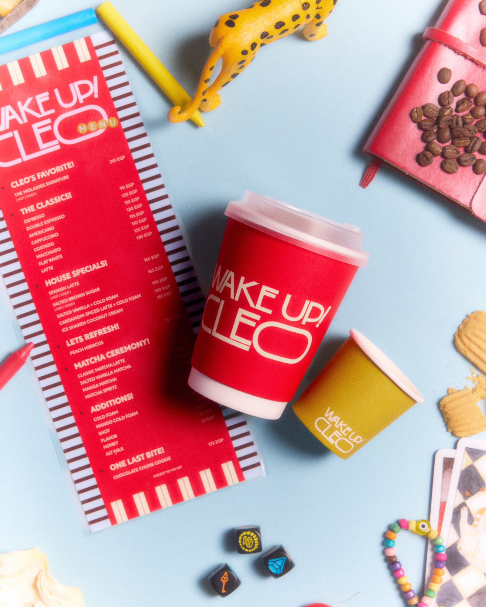
Photography & Content StyleThe imagery direction was built around “how Cleo would capture herself” — spontaneous snapshots, hands carrying stuff, meals shared with friends, tables left as they were. It's meant to feel like a lived-in personal archive rather than a curated feed: quiet observations, colorful still life, playful close-ups of the drinks themselves.